

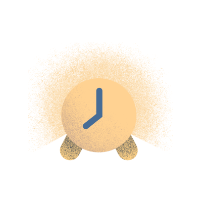
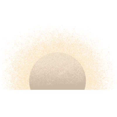
Sunrise alarm
Your alarm isn't your enemy when you wake to a gradual sunrise.
<GridContainer> ComponentThe grid container is a global class to attach to components the user wants to add responsiveness to. Most sections on the site that are not full-bleed will utilize this container. Max width will be clamped to 1312px on most desktop screens and padding ensures content will not touch the edges on narrow mobile screen widths. We typically do not use margin, with the exception of centering block elements as seen below.
.grid-container {position: relative;margin: 0 auto;width: 100%;padding-left: 16px;padding-right: 16px;@media (max-width: 767px) {max-width: 616px;}@media (min-width: 768px) and (max-width: 1023px) {padding-left: 40px;padding-right: 40px;max-width: 960px;}@media (min-width: 1024px) {padding-left: 44px;padding-right: 44px;max-width: 1312px;}}
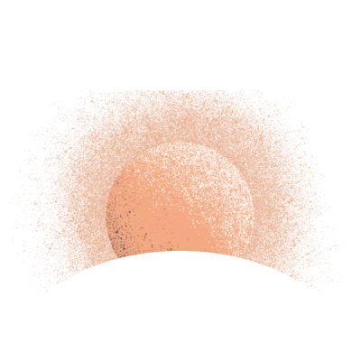
Your alarm isn't your enemy when you wake to a gradual sunrise.
Take a moment to get inspired before you get out of bed.
Leave your busy days behind and unwind with a sunset.
Tap into your circadian rhythm to get rest that works for your body.
Listen to stories, music, dreamscapes, and guided rest while you drift off.
Made to blend into your bedroom and create an uncluttered, relaxing space.